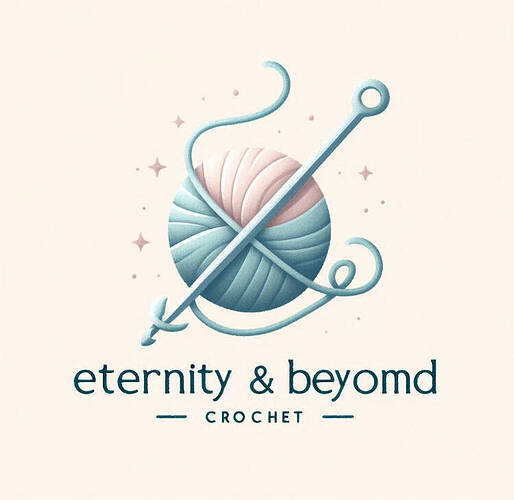
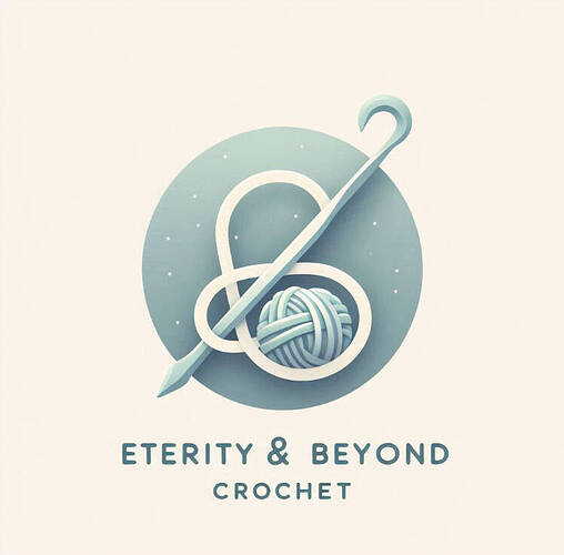
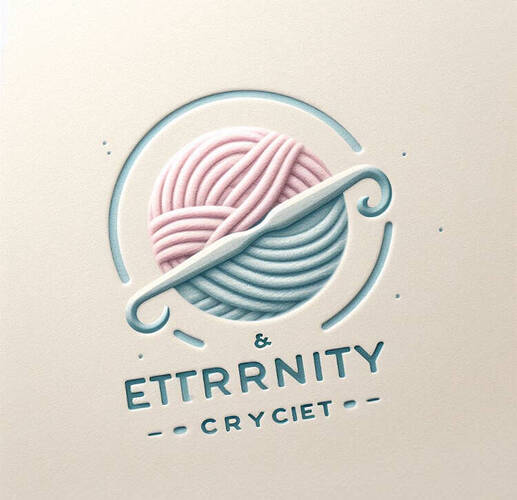
more options and please remember these are generated so spelling is not correct but i will fix
- 1
- 2
- 3
- 4
- 5
- 6
- keep designing
I like 4 the best. It looks the cleanest while still being bright and cheery. I do agree the beyond is a little off, it could be spaced a little to the right. But its not a big deal, most people wouldnt notice. I also really like the colors better.
I LOVE #4, and maybe #3
A lot of people on Ribblr are happy to design logos for others. Instead of using AI generated images, maybe you could ask if anyone would be happy to help make one for you?
rahh im so happy to see ppl using my space again ![]()
![]()
i like the first #2 and #5! i think out of all of them they look the least ai generated
I like 3 and 4 but with crochet hooks
I know i’m just not good at reaching out Thanks for the idea though.
It’s ok, just post a topic asking if anyone would like to make you a shop pfp and banner(usually you offer a reward like a custom pattern, priority testing, early access to a pattern, etc) and people might reach out to you about making one!
I understand, I’m also quite shy. But the community is very friendly here and like @Bobacat123 said, you can make a topic asking if anyone is interested and you might be surprised ![]()
I agree, I am shy around new people but everyone here on ribblr is kind and friendly!![]()

