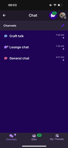
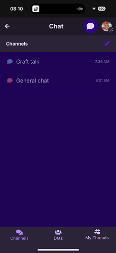
I don’t really like the new update…I was wondering if anyone else did. The colors mess with my astigmatism badly and I can barely read anything ![]() I wish there was a filter to turn it off
I wish there was a filter to turn it off ![]() it’s a good update the colors just mess with me
it’s a good update the colors just mess with me ![]()
I like the update and the new interface, but I’m having the same issue with the colors. It’s already giving me a migraine and I opened the app like 5 minutes ago. The light purple text over dark purple background is incredibly hard to read. Even in these posts it hurts trying to read the text.
The color in the chats is hurting my eyes even worse.
This basically makes the app unusable for me
Yeah, it just messes with me and then I get a headache and I get dry eyes from screens and this is really effecting that ![]()
The colors are actually helping me because harsh colors such as black or pure white give me massive headaches and eye strain. I can actually read again
Two questions:
- are you using just dark mode?
- is this only happening in the community, or across the entire platform?
Me too!

the colors are kinda classy, but everything else about the update I love!
I have the same settings as everyone else that is having this issue. Everyone I know has the same colors as well. It is not an issue on my end. It’s the actual update with the colors chosen that are messing with me. It’s hard to read white on a cool tone blue ish purple. And the colors don’t go together that well either and that makes it harder to read on. It’s the colors I’m having issues with. Not the settings. Everyone I know has the same colors as I do. And it’s bothering them as well.
Totally get that, we don’t think it’s related to your device - but we’re trying to pinpoint the issue as it’s to do with our recent changes.
Can you please answer the following questions?
Dark mode is on and it’s across the entire platform
i love the new update too, but the colors are too similar and it´s kinda difficult to read, especially the colors in chat
![]()
Thanks! we’re looking into it.
well do you have an iphone? Because I changed my phone settings from dark mode to light and now the app is white with purple words :)
The white with purple text will not make it better I tried ![]() it makes it worse
it makes it worse
Gotta agree, I can’t really see much of anything, I’ve got really bad astigmatism even with my glasses :( until yall fix this im not gonna be able to use the app much at all
Yeah
Oh I just use light mode, it doesn’t have that!
From a design and color contrast point, they work good together, but from an actual user perspective they are hard to read.
I do like the change to a better font (even its a change not many people will notice). The font doesn’t entirely help with the problem though.
A change I would make based on my experience is making the background slightly darker, its a small change, but will pop even better against the light purple/pink chosen for the font.
Its always hard to be told that a design choice is causing issues for people when you worked hard at it, but unfortunately it happens. I hope everyone at the design team at ribblr can get this issue solved!
Thanks for sharing everyone! we already went ahead and made changes to colors in dark mode, particularly on the chat where it has been too contrast-y. We’ll be working through making more improvements as we usually do, but do let us know if you see more buttons, icons that have a similar issue.
We appreciate your help and as always you can change your settings between dark mode and light mode to choose your best theme. By default Ribblr will just follow your device’s settings but you can force light/dark mode too just for Ribblr.
I almost immediately noticed the change and its already much better for me! Thank you design team:D


