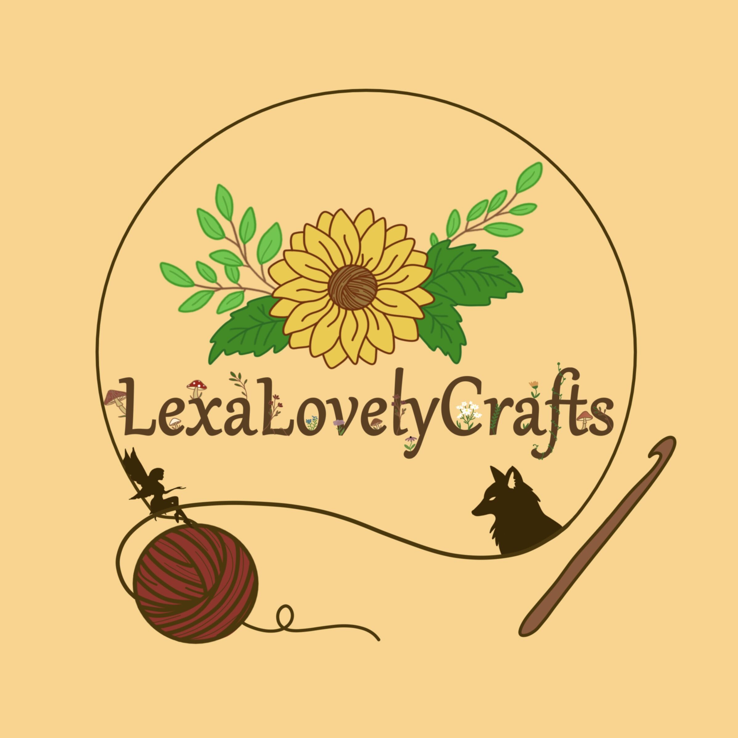
Hey guys! I’ve decided it is time to change my profile picture to represent me more as a person (as well as my shop of course)! When I first created my profile picture, I had no idea what to do since I wasn’t sure what I wanted to create.
Here it is!
What do you guys think?
- I like it!

- I hate it!

- It’s missing something or change something! Comment

16 Likes
I think it’s great!!! It’s just you can’t see the little details when it’s added to your pfp, which is kinda sad because they are so cute!
4 Likes
The new design is lovely! I absolutely adore the small flowers <3 Also can’t wait for the critters to release!!
1 Like
I like it, though I think your details would stand out more if the background was a different color or shade. Otherwise, great job.
This is essentially what I was going to say! It’s a great design and I think having a text that doesn’t have as many details would help focus on the rest of the awesomeness :)
1 Like
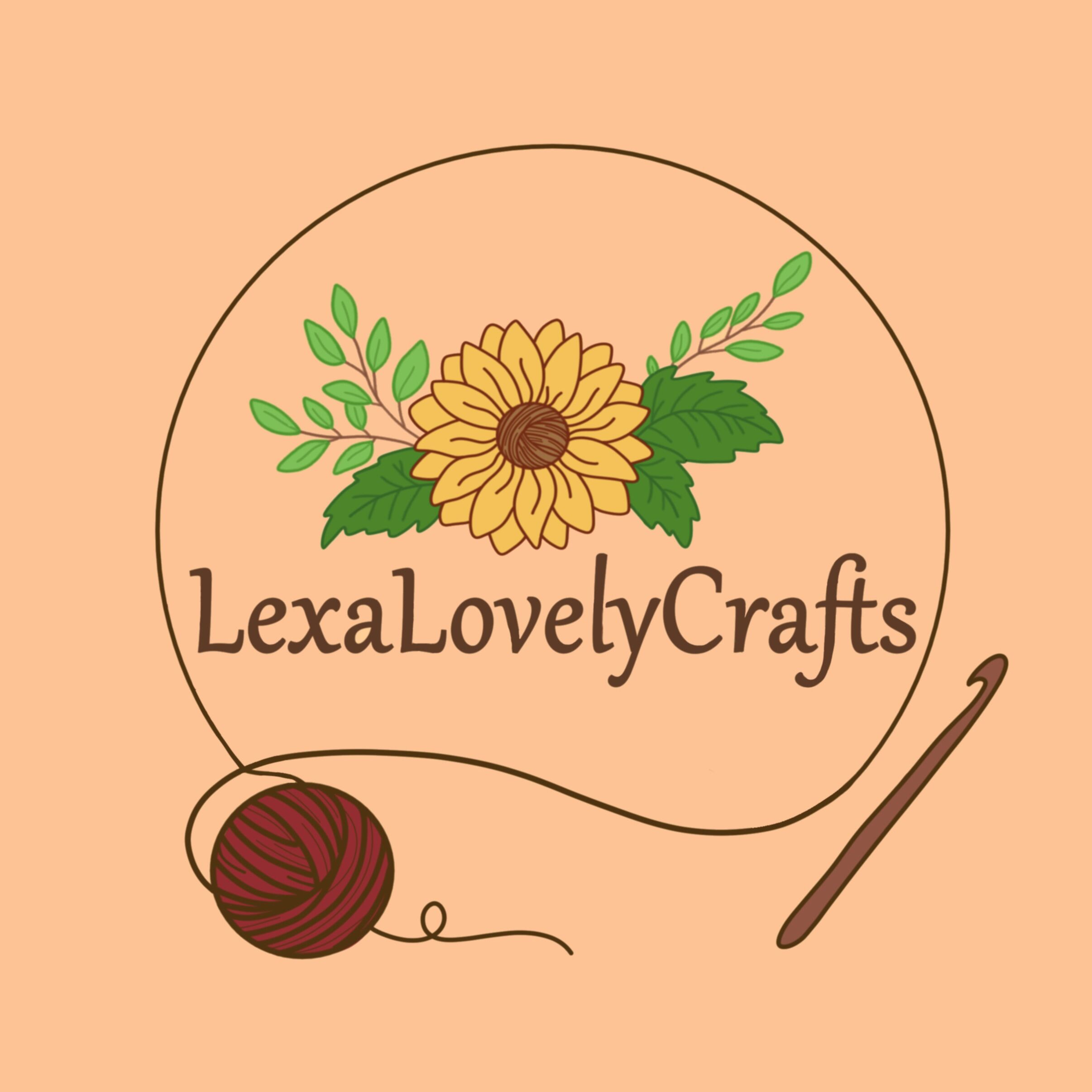
I’ve removed all of the designs! How does it look?
The background is supposed to be a peachy color… I don’t know why it’s turning yellow here 
3 Likes
The background is a nice color. I think the design elements need to stand out more. Something to make them pop. Maybe brighten them?
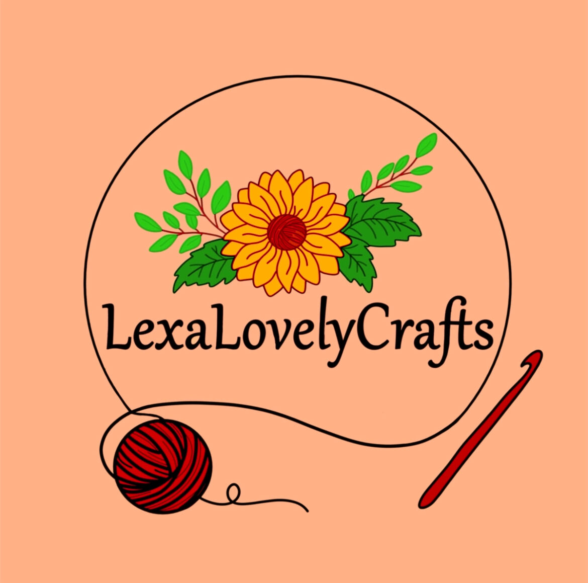
I personally like it better. The designs stand out against the background and look good.
1 Like
WOAHHHH this one looks so good!!
2 Likes