
Hi there, is there something I can do to improve the definition between color changes while doing intarsia? So the lines of the design look much cleaner? The picture below is my gauge swatch and I am not quite satisfied with the result 

11 Likes
Check out these videos:
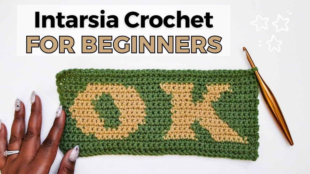
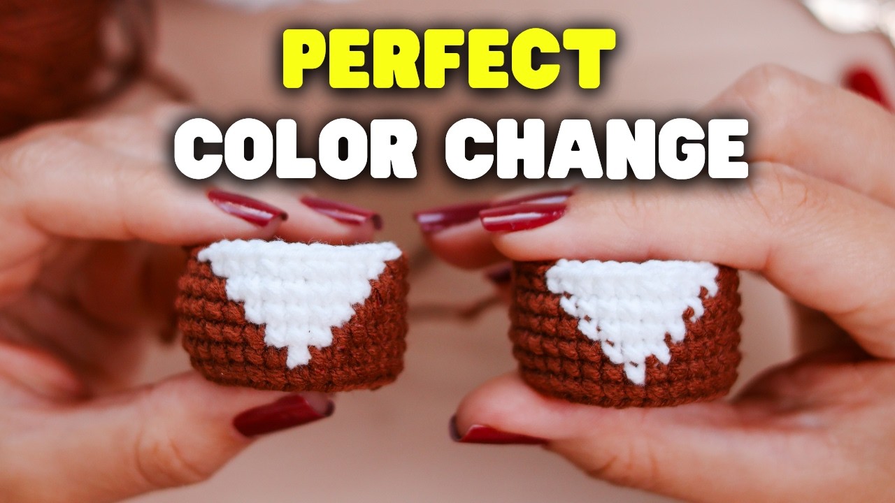
2 Likes
game changer ! tyvm 
1 Like
It’s still pretty already. What are you going to make?
2 Likes
the Nana sweater by MahalMadeCo 

1 Like
Looked it up, that’s like a piece of art to wear
1 Like