

Here’s a new drawing pls give feed back be mean!
36 Likes
I love it!! I’m not the greatest at drawing so I don’t have feedback but it’s so cute!!
8 Likes
u want us to be mean? im not good at being mean 
9 Likes
Omg this is adorable!!! The only advice I have is to give the hair a bit more detail and sweeping motion
The clothes seem perfect, maybe add just some mild texture to the shorts bc they seem really plain
And lastly the eyelashes seem kinda bold and large compared to the eye itself. I would say shrink them a little bit if you want them bold. Or shrink them a tiny bit and thin out the line you used for them
7 Likes
Hmm it looks good but I think you might need to go over your line art it seems to be a bit scribbly
6 Likes
One thing I like to do is use a thicker brush and then use an eraser tool to smooth everything out
4 Likes
The scribble look is cool tho with the style of person they drew.
For me personally, line neatness depends on the whole esthetic, so for this particular drawing, the scribble lines look good with it
4 Likes
Ok :)
4 Likes
I would just add detail to the clothes, but that’s awesome.
Btw would you like to be added to an art gc where we share the art we do?
3 Likes
Okay, I’ll give feedback as a fellow artist! (Sorry if this was kinda mean…)
1: The hand is holding the hip, but the hip seems to be sorta off, disconnected to the stomach.
2: The neck is a bit small, you can widen it a bit.
3: The shoulders are disproportionate. If you are trying to convey a fully forward body like the head, then the arm that is not holding the hip would be not in front of the body.
4: Try learning how t shirts work. Like the folds and stuff, it makes the drawing much better.
5: The characters body can be a bit bigger. I know that anime characters are drawn thinly, but you need to either make the legs thinner or enlarge the head to stomach.
Note1: You can try using a smaller size for lineart, I use a 10 to 20 in digital and a 0.5mm in traditional.
Note2: If you change to bg color to a bold color like the same color you used for the lines, the drawing will pop out better.
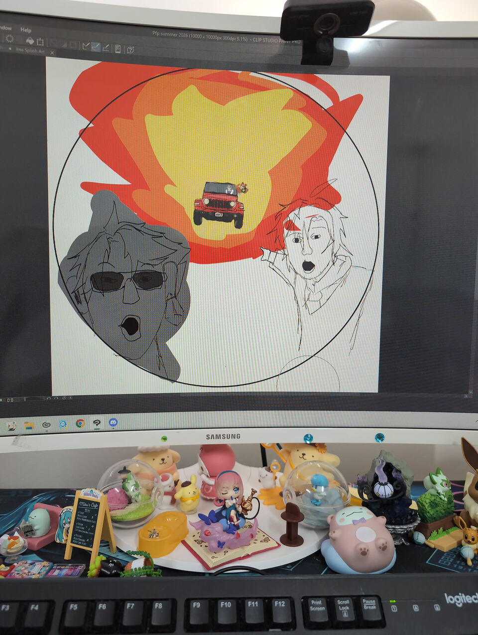
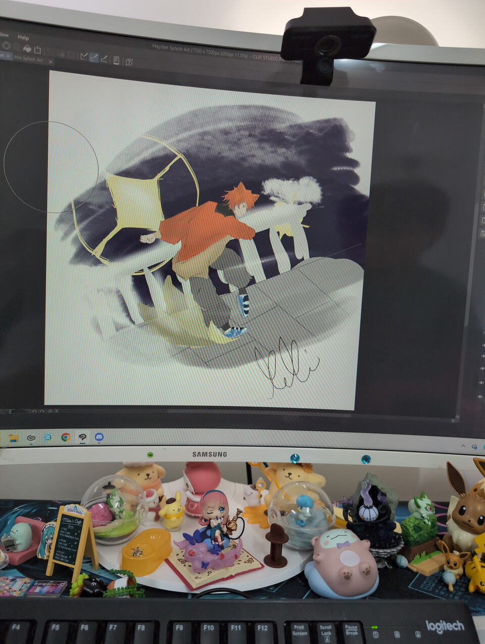
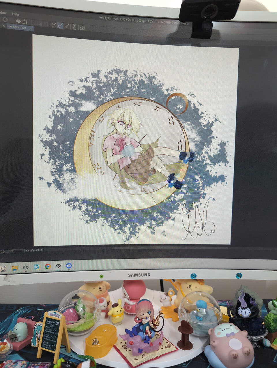
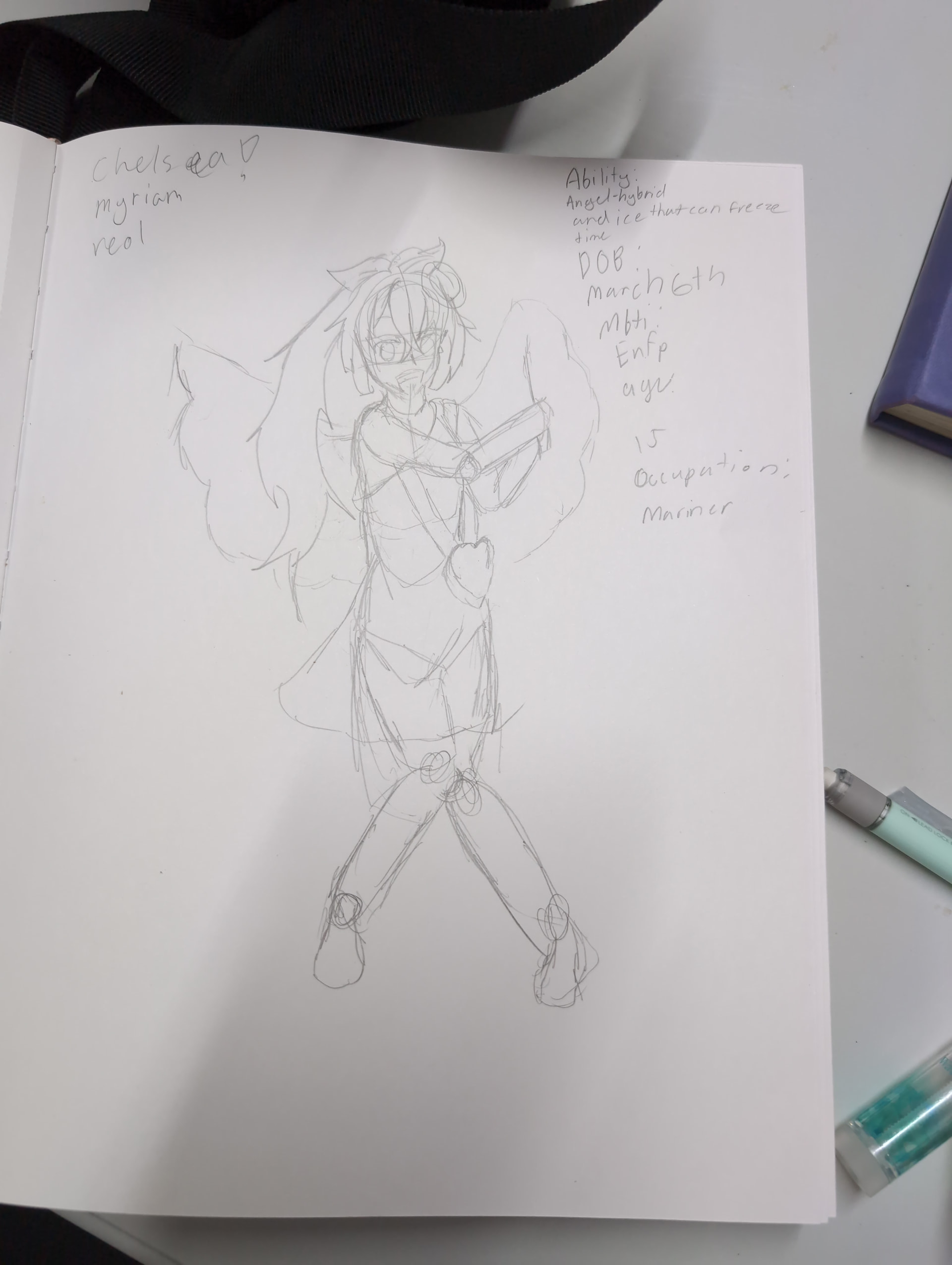
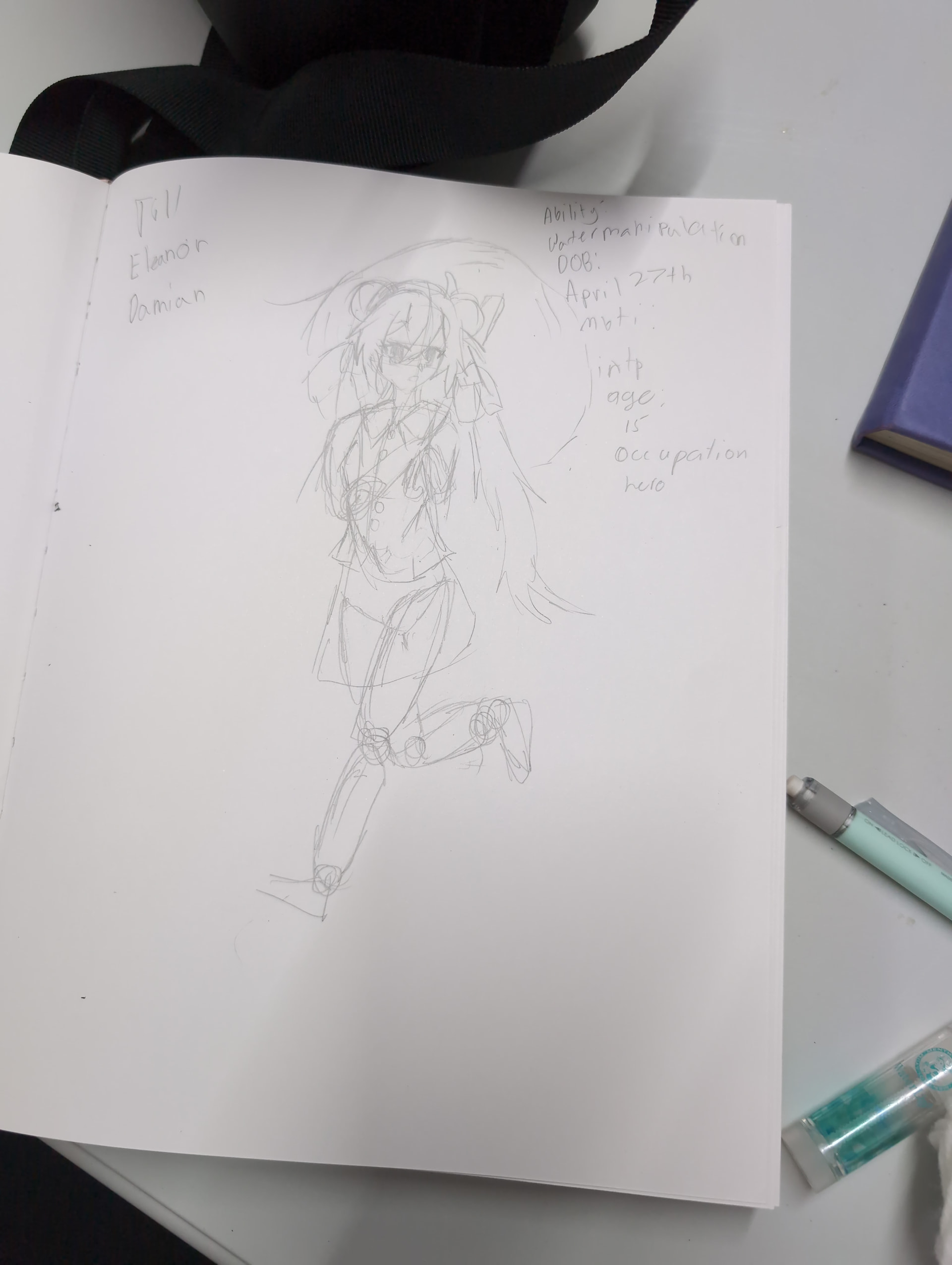
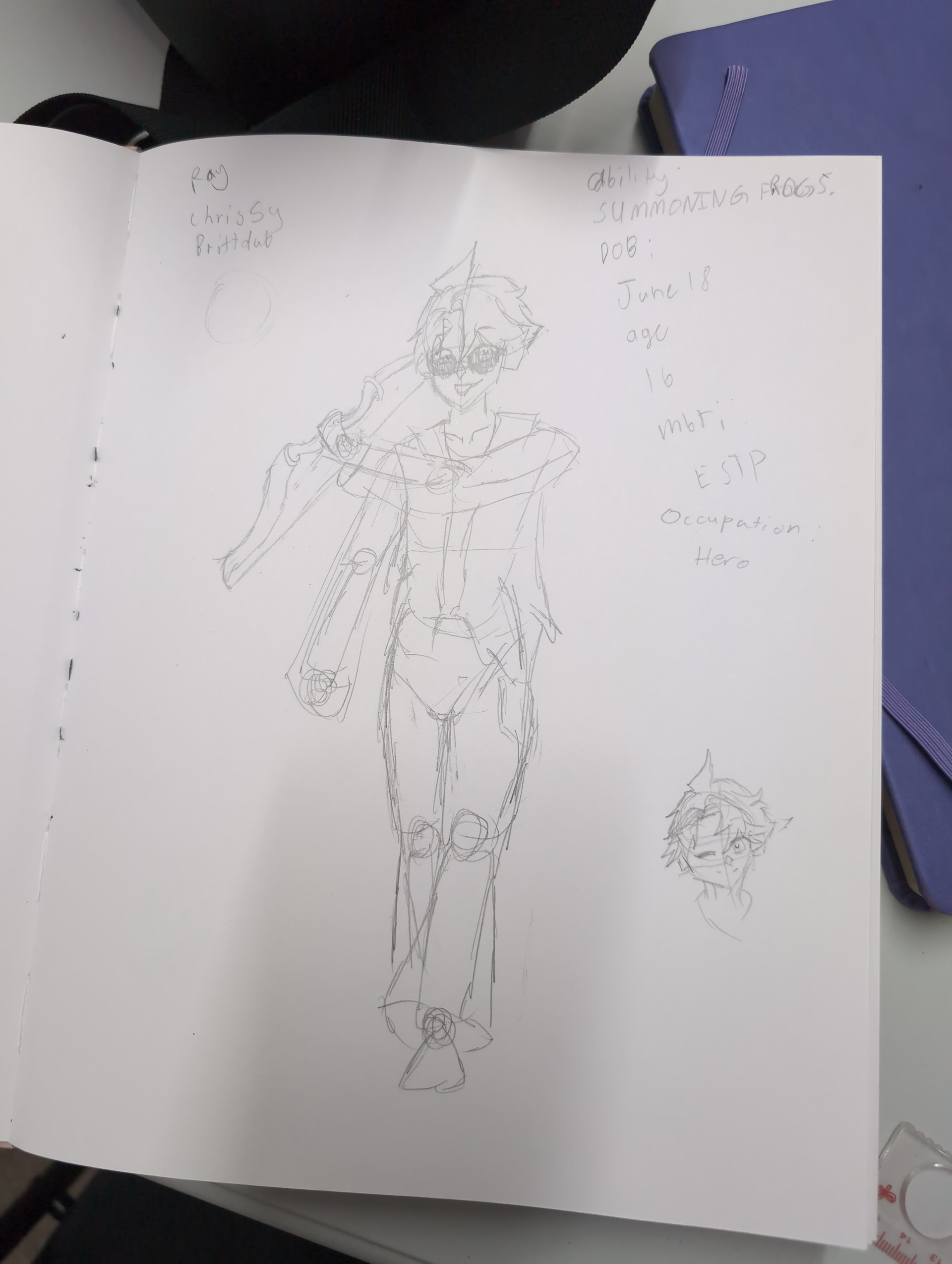
Heheh
6 Likes
it looks ado0rable! here’s my feedback!
˚‧︵‿₊୨ improvements ୧₊‿︵‧˚₊⊹
i feel like the neck is a little thin and the hand on the hip below the arm is a little off
୧₊‿︵‧˚₊⊹ᰔgood thingsᰔ୧₊‿︵‧˚₊⊹
i LOVE the shading an coloring i never color my drawings i basivly shade it like a manga and you went the extra mile!
whatever base, eyes and hairstyle you used are really cute!
i also love the clothes it’s even something i would wear irl
that’s all! sorry if i was mean in the improvements!
3 Likes
Ok the only thing for me would me widen the neck and detail the hand!
3 Likes
If u want mean: FINGERS!!! Also, the head is a lil smol and the neck is a bit smol too. I literally can’t think of any other problems!
2 Likes
Thanks!!
1 Like
Smart thx!
2 Likes
Yes pls!!
3 Likes
Thanks and you’re really good!! And not mean at all
3 Likes
Thx!
1 Like
Ik drawing hands can be hard but definitely try! Uhm the hair looks good as well maybe working on your shading could help and working on proportions. As well as working on making the hair  flow so it looks less still and more natural
1 Like
To me it looks awesome and I love it sm but I’m no artist so yah
2 Likes